

Skeptical Science Graphics by Skeptical Science is licensed under a Creative Commons Attribution 4.0 International License.
This is one of the climate myths debunked on the ‘Debunking and Pre-bunking Misinformation’ page of the Climate Wiki (in Dutch). For a full list of climate myths, see the end of this article.
There is all sorts of misinformation and disinformation circulating about climate change. This poses a major threat, as it undermines support for effective measures against global warming and influences the choices people make at the ballot box. That is why it is vital that scientists and climate campaigners debunk these myths. The climate myths page combats common forms of disinformation using reliable scientific information.
Were the 1930s much hotter than today?
When unadjusted weather data from the United States is compared with recent data, it appears as though extreme heat was much more common 90 years ago. However, the presentation of weather data is distorted because most weather stations in the 1930s were located in the ‘Dust Bowl’ of the US Midwest. That region was indeed plagued by extreme heat and drought, whilst the rest of the world was largely cooler.
What science says

Correcting the raw temperature data for changes in measurement methods and for the uneven spatial distribution of weather stations paints a very different picture. The ‘Dust Bowl’ was an exception in a world that was, on average, cooler than it is today. Such corrections to measurement data are very common in science to prevent a distorted picture of reality from emerging.
Climate myth
“The top five years in which record highs were recorded all fell in the 1930s. Not a single year from this century features in the top fifteen. Last year [2011] didn’t even make the top sixty.”
A Simple Proof That The 1930s Were Hotter. Real Climate Science. 1
Newly found weather records show the 1930s to have been far worse than the present in terms of extreme weather. Watts Up With That. 2
More facts and explanations
Raw data, wrong conclusions
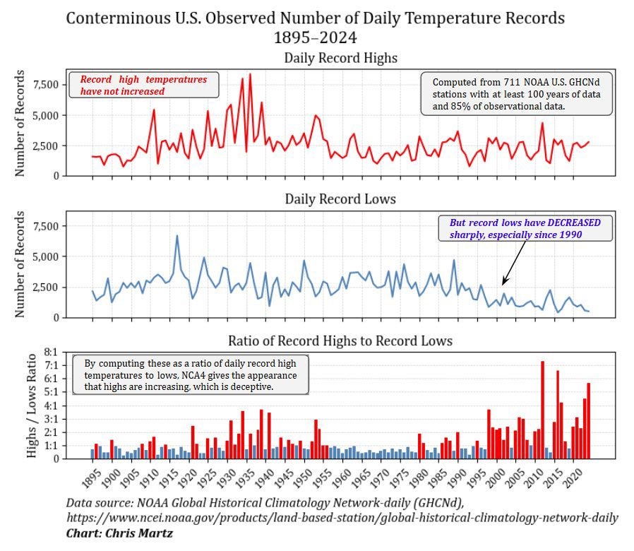
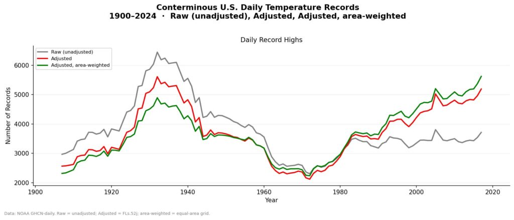
A graph often circulates on social media suggesting that far more temperature records were broken in the 1930s than today. For climate sceptics, this is a favourite argument: if it was warmer in the past, why worry about global warming?
3
In an article on the website The Climate Brink, climate scientists Andrew Dessler and Zeke Hausfather investigate whether that graph is accurate. 4
Reproducing the graph
The authors use the same dataset as the original graph: the Global Historical Climatology Network-daily (GHCNd), 3 which contains daily raw (uncorrected) temperature data from 1,266 observation stations in the United States. They do indeed observe the same pattern: in the 1930s, there was a massive spike in heat records.
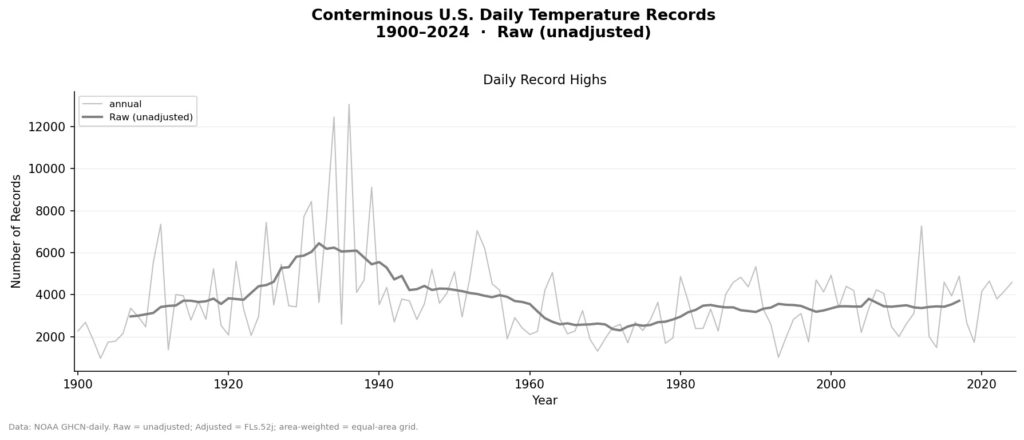
So far, the climate sceptics’ narrative seems to hold true.
Correction 1: Correcting for changes in measurement methods
The problem is that these data are ‘raw’ — they have not yet been corrected for known anomalies. Over the past century, there have been many changes in the way temperature is measured: observation times have shifted, glass thermometers have been replaced by electronic ones, weather stations have been relocated, and urban growth has affected local temperatures. All these factors introduce systematic errors.
The authors apply the corrections used by the NOAA for its homogenised monthly dataset to the daily data. The result: the number of heat records in the 1930s falls, whilst the number of recent records rises.
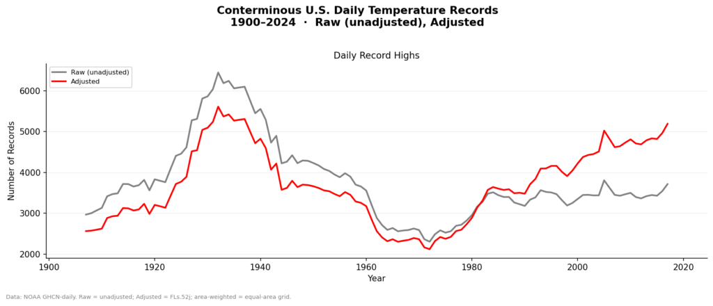
The two periods now appear roughly equal, and from the 1970s onwards an upward trend emerges — exactly what you would expect on a warming planet.
Correction 2: Correcting for spatial bias
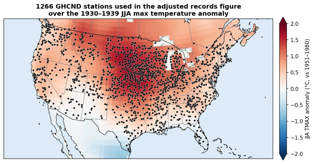
The observation stations are not evenly distributed: many are located precisely in the region where the heat was most intense in the 1930s — the ‘Dust Bowl’ area in the centre of the US. As a result, the heat of the 1930s is over-represented.
4
By grouping the data into a grid and then weighting the averages by area, this bias is eliminated.
4
Now, the number of heat records in the 2000s is clearly greater than that of the 1930s. Independent confirmation comes from the Berkeley Earth daily dataset,
5 which shows a similar result.
Why are corrections common practice?
Data corrections are entirely standard practice in science. The authors compare this to image processing from the James Webb Space Telescope 6 — where pixel values are adjusted and artefacts are removed — and to the UAH satellite temperature data, 7 which is thoroughly corrected for differences between satellites, altitude loss and shifts in observation time. If you do not correct data for known errors, you will, by definition, get the wrong result.
Cherry-picking
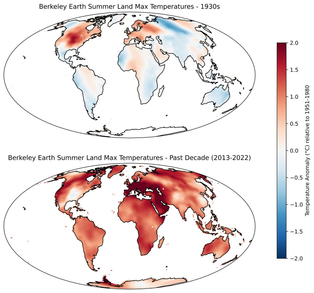
The focus on the US in the 1930s is also a classic case of cherry-picking. The extreme heat was a regional phenomenon, caused by drought and poor land management. 8 If the authors had chosen a different region, this result would not have emerged — not even with raw, uncorrected data. Today, it is roughly as warm in the US as it was in the 1930s, but the rest of the world is also warm.
4
Conclusion
A graph that (1) focuses on the US, (2) highlights the 1930s and (3) uses raw, uncorrected GHCNd data is almost certainly misleading. The authors therefore recommend recognising such graphs as a ‘1930s scam’.
More climate myths
As noted before, the Klimaatwiki is in Dutch. This is a list of debunked climate myths on the Klimaatwiki.
- Did global warming stop in 1968, 1978, 1998, 2010 or 2018?
- Does cold weather disprove global warming?
- Are carbon dioxide emissions from human activities sufficient to affect the climate?
- Are CO₂ emissions beneficial because they provide food for plants?
- Do volcanoes emit more CO₂ than humans?
- Does man-made CO₂ have a detectable signature?
- Are high CO₂ concentrations harmless because they also occurred in the past?
- Can humanity cope with global warming?
- Is extreme weather becoming more common as a result of climate change?
- Is the rise in CO2 lagging behind the rise in temperature?
- Is the Greenland ice sheet shrinking?
- Is the Antarctic ice sheet growing?
- Is sea-level rise not as bad as feared?
- Is solar energy more expensive than fossil fuels?
- Do the 31,000 signatures on the OISM Petition Project undermine the scientific consensus on climate change?
- Was the Medieval Warm Period a global event?
- Is climate science melting away?
- Is flying to Barcelona better for the climate than travelling by car?
- https://realclimate.science/2012/08/10/a-simple-proof-that-the-1930s-were-hotter/#gsc.tab=0[↩]
- https://wattsupwiththat.com/2012/07/14/newly-found-weather-records-show-1930s-as-being-far-worse-than-the-present-for-extreme-weather/[↩]
- https://www.ncei.noaa.gov/products/land-based-station/global-historical-climatology-network-daily[↩][↩]
- Raw Data Wrong Answers https://www.theclimatebrink.com/p/raw-data-wrong-answers[↩][↩][↩][↩][↩][↩]
- Data Overview https://berkeleyearth.org/data/[↩]
- NASA: How Are Webb’s Full-Color Images Made? https://science.nasa.gov/mission/webb/science-overview/science-explainers/how-are-webbs-full-color-images-made/[↩]
- Global Temperature Report. The University of Alabama in Huntsville https://www.uah.edu/aosc/data-products/global-temperature-report[↩]
- Present-day greenhouse gases could cause more frequent and longer Dust Bowl heatwaves. Nature Climate Change https://www.nature.com/articles/s41558-020-0771-7[↩]